Tuesday, 16 November 2010
Friday, 12 November 2010
Tuesday, 9 November 2010
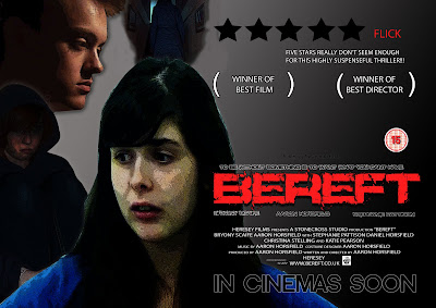
Film Poster

Above is my finished and constructed version of my film poster, I believe it to be effective and applicable to the genre I am trying to represent. For the use of cinematography within the poster, I tried to go with a varied amount of camera shots and distances with my models; ranging from close up to long shot. I changed the image I was going to use due to the original image (flat plan) leaving too much dead space and not really expressing the mood I wanted to portray with my poster, so I took a variety of shots of my models in various poses, to add more activity to the poster, while showing some of the confusion within the film. With the images I wanted something that was expressive of my genre, so I tried to get my models/characters in foreboding or expressive poses that showcases my horror/thriller genre, this was done with the use of facial expressions, clothing (hood) and body language. With the image I also wanted to do some adjustments on photoshop to add to the feeling of the genre, so again like I did with the magazine I played around with the adjustments; this time brightening some of the colour and increasing the contrast minutely to make the images stand out more, but also using the filter; dark stroke, on the image to give a depressing dark impression to the images. With the text I stuck to my flat plans plan as much as possible, using a large red font as my title, this had the bonus of standing out, but also has negative connotations, when you consider the colour red. The font for my title was something I gained from dafont.com when looking in distorted classification, the use of such a font meant not only did the colour express something but the font itself showed the genre of the film. With all the text I used a variety of fonts, for the text that was not to be a focal point I used a less characterized font, so as to be less noticeable, but still be seen as it is white on a black background. With the layout, I tried to make the product look as professional as possible by looking at other pieces of work such as Eden Lake and trying to use that as a template, this would mean that the audience would be more responsive to the poster. Like my flat plan I included a review, so as to remain professional, but also get the audience more interested, as it is one persons view on the film.
Friday, 5 November 2010
Magazine Front Cover

Above is the constructed version of my magazine front cover, I tried to keep the cover as close to my previously planned flat plan as possible, yet still made some changes here and there. With the type of shot and shot distance, I didn't stick to what I had previously planned, as I found that a mid shot of my models head was not appropriate for a film magazine and did not appropriately display the thriller/horror genre I was trying to portray, this was due to the fact that it was too reminiscent of a happy chatty sort of magazine. With the actual image, I wanted an image that stood out, so with the use of photoshop I used a dark strokes filter, to give it a more roughed out appearance, which would be more appropriate to a horror film, while I used image adjustments, to leach some of the colour out of the image and brighten the little that was left. The text font was something I put into contrast with other magazines, as I found that all fonts, were reminiscent of the genre they were portraying or linked in with the image itself. So to continue on this trend, I found text that i deemed applicable to the cover on dafont.com. With the header I wanted something that stood out, so I constructed it so that it dominated the top of the page in bold red colour, which would attract the audiences attention and draw them into reading the magazine, also the colour red has negative connotations, such as blood and death which link in with my genre. The colour scheme itself was inspired by other film magazines, as they seemed to go for colours which were quite basic, yet stood out, so I tried to do a similair thing, with the use of red, blue, black and white, with the use of these colours also signifying a sense of patrionism in the reader as it is a british magazine and three of those colours are on the british flag, which my make the reader more indeared to the magazine and more likely to read it and buy it. With the layout and items on the page I wanted something that was busy yet not overbearing and also very reminescent of any other film magazine, so I set it out with special offers and incentives, so as to appear realistic and attract an audience to it, also my audience of a younger generation would probably be very endeared to the idea, as they would get more for there money.
Subscribe to:
Comments (Atom)


