Tuesday, 16 November 2010

Evaluation Question 2 - How effective is the combination of your main ancillary tasks?


Evaluation Question 1 -In what ways does your media product use, develop or challenge forms and conventions of real media products?


Friday, 12 November 2010

Tuesday, 9 November 2010

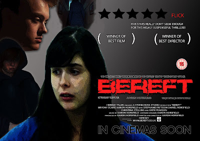
Film Poster

Above is my finished and constructed version of my film poster, I believe it to be effective and applicable to the genre I am trying to represent. For the use of cinematography within the poster, I tried to go with a varied amount of camera shots and distances with my models; ranging from close up to long shot. I changed the image I was going to use due to the original image (flat plan) leaving too much dead space and not really expressing the mood I wanted to portray with my poster, so I took a variety of shots of my models in various poses, to add more activity to the poster, while showing some of the confusion within the film. With the images I wanted something that was expressive of my genre, so I tried to get my models/characters in foreboding or expressive poses that showcases my horror/thriller genre, this was done with the use of facial expressions, clothing (hood) and body language. With the image I also wanted to do some adjustments on photoshop to add to the feeling of the genre, so again like I did with the magazine I played around with the adjustments; this time brightening some of the colour and increasing the contrast minutely to make the images stand out more, but also using the filter; dark stroke, on the image to give a depressing dark impression to the images. With the text I stuck to my flat plans plan as much as possible, using a large red font as my title, this had the bonus of standing out, but also has negative connotations, when you consider the colour red. The font for my title was something I gained from dafont.com when looking in distorted classification, the use of such a font meant not only did the colour express something but the font itself showed the genre of the film. With all the text I used a variety of fonts, for the text that was not to be a focal point I used a less characterized font, so as to be less noticeable, but still be seen as it is white on a black background. With the layout, I tried to make the product look as professional as possible by looking at other pieces of work such as Eden Lake and trying to use that as a template, this would mean that the audience would be more responsive to the poster. Like my flat plan I included a review, so as to remain professional, but also get the audience more interested, as it is one persons view on the film.

Friday, 5 November 2010

Magazine Front Cover


Above is the constructed version of my magazine front cover, I tried to keep the cover as close to my previously planned flat plan as possible, yet still made some changes here and there. With the type of shot and shot distance, I didn't stick to what I had previously planned, as I found that a mid shot of my models head was not appropriate for a film magazine and did not appropriately display the thriller/horror genre I was trying to portray, this was due to the fact that it was too reminiscent of a happy chatty sort of magazine. With the actual image, I wanted an image that stood out, so with the use of photoshop I used a dark strokes filter, to give it a more roughed out appearance, which would be more appropriate to a horror film, while I used image adjustments, to leach some of the colour out of the image and brighten the little that was left. The text font was something I put into contrast with other magazines, as I found that all fonts, were reminiscent of the genre they were portraying or linked in with the image itself. So to continue on this trend, I found text that i deemed applicable to the cover on dafont.com. With the header I wanted something that stood out, so I constructed it so that it dominated the top of the page in bold red colour, which would attract the audiences attention and draw them into reading the magazine, also the colour red has negative connotations, such as blood and death which link in with my genre. The colour scheme itself was inspired by other film magazines, as they seemed to go for colours which were quite basic, yet stood out, so I tried to do a similair thing, with the use of red, blue, black and white, with the use of these colours also signifying a sense of patrionism in the reader as it is a british magazine and three of those colours are on the british flag, which my make the reader more indeared to the magazine and more likely to read it and buy it. With the layout and items on the page I wanted something that was busy yet not overbearing and also very reminescent of any other film magazine, so I set it out with special offers and incentives, so as to appear realistic and attract an audience to it, also my audience of a younger generation would probably be very endeared to the idea, as they would get more for there money.

Sunday, 31 October 2010

Model Release Forms

Examples of Model Release Forms -
To use actors within my trailer and be able to show the footage I had to get their written permission for its use, here are some examples -


Tuesday, 5 October 2010

Shots from Magazine shoot

Some shots from the Magazine shoot -


-Good Lighting

- Applicable to the genre and storyline of the film

- Good shot distance

- Dosen't show some amount sophistication

- Good lighting of models

- Nice shot distance for potrait magazine image

- Good picture to manipulate with effects


- Good lighting

- Slightly blurred at edges

- Good close-up, could be used in contrast to usual shot for film magazine, gaining the audiences attention


- Good contrast in lighting, brightness may want to be reduced

- Applicable to the storyline, as being trapped is within the storyline

- May not be good for potrait magazine, as the image is a landscape one


- Nice shot distance

- Good lighting, slightly blurred

- May not be suited to film magazine

Thursday, 23 September 2010

Shooting Schedule


For the shooting schedule I didn't include time codes because I was still playing with the idea of mixing up the chronological order. While the dates I was unsure about, due to the actors other involvements, but, while the filming was spread out over a two week period within late october.


Thursday, 9 September 2010

Skills Development

Teeside University trip (Skills Workshop) -


Upon arriving at Teeside University we were taken to a room, were we were given the chance to look at the technical workings of some sophisticated cameras, such as looking at the focus and white balance and how to adjust them to be suited to the setting needed. The lecture was great in developing my knowledge and skills with camera's as it allowed me to have some hands on experience, by allowing us to do it all ourselves. After being shown how to work the camera we were given a chance to work in pairs and use the camera to develop a variety of shots highlighting the Teeside campus and adjusting the camera's settings manually to get some good shots with optimum settings. After this we uploaded the clips to final cut pro and edited them together to produce a small clip, with some music placed into the background, this gave me the chance to use final cut and gain some experience with the software, as we would be using that to construct our own trailer in the end. At the end we were given clips from the film Gladiator and asked to piece them together to construct a trailer, this gave me more experience with final cut, such as putting sound files underneath clips so that the sounds can be heard while clips play over the top of them, also it gave me a chance at looking what the narrative of a trailer would be better as, such as how to start the trailer of and how to hook the viewer. I also gained some experience with the tools within final cut, such as the knife tool, which i used to cut clips to the size I wanted, or to get the clip I wanted.

*Images wont upload, so needs trying at home.

Skills Development Promo -


In preparation of making a trailer, we were instructed to construct a promo for Media Studies, using a variety of shots to tell people of the benefits of the subject and why they might enjoy the subject. This activity allowed me to learn some skill with Final Cut Express the software in which we used to construct the promo, this involved using tools like the knife tool to cut scenes to the size that I wished and overlaying scenes so that you could hear certain sounds but you couldn't see were they were coming from.

Skills Development Promo 2 -