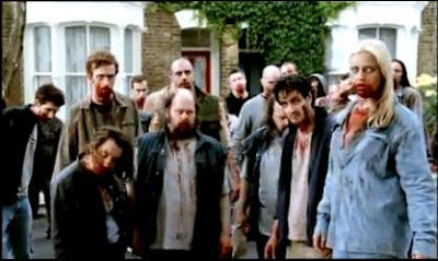
The use of clothing and make-up in this shot projects the idea of a horror and zombies quite basically through the use of tattered, dirty looking clothes and blood surrounding the mouth, giving the impression of a zombie and therefore looking to appeal to the horror genre. The clothing like the shot before, gives the impression of everyday life again, due to the quite normal looking clothes, meaning the audience is probably a group of people from 18-45, due to the fact that it is both a horror and comedy, something which may be to explicit for a younger audience, while also uninteresting to an even older audience, due to the comedy, which may not appeal to them. The body language and facial expressions, are typical of a horror/ zombie film, because they project the death like quality with their delapitdated and injured appearance, this appeals to a horror audience through this medium.
Cinematography -
Shot 1 -
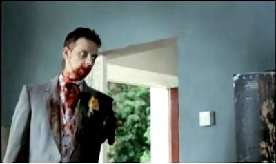
A low angled mid shot is used here, so as to create a more dramatic shot, as the character/ zombie appears to be looking down on the audience or characters, therefore appearing more intimidating and representing the genre of horror. The use of a mid shot here, allows the audience to take in the characters mise-en-scene and find some humour in it, as it seems quite ironic in that on "the happiest day of their lives" the character/groom has been mutilated and attacked, something which may give it a humouress twist and showing the comedy undercurrent. The cinematography is also used so that the character is on the left side of the screen, showing them to be in power and in combination with the low angled shot, it gives a more intimidating shot and reflects its horror genre, maybe therefore trying to target a male audience as horror and comedy would seem to reflect something that a man might be interested in.
Shot 2 -
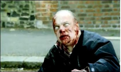
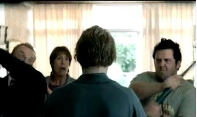
An over the shoulder shot is used here; a shot that typical gives the audience the feel that they could be there themselves watching this in real life, as it is straight on, this maybe used so as to involve the viewer and therefore get them more interested in what they are watching and then making them want to go and watch it. The shot has a quite humourous undercurrent as the fact that a slobbish looking man and unlikely hero are both hitting this unknown person with shovels, trying to save the day, this is something unlikely to happen in real life and therefore quite funny in reflection. The fact that it is an over the shoulder shot means that the character in the middle of the frame is brought into focus, while the others are more of secondary focal point, meaning that when looking at the frame, you see his head and then you go onto see the two guys with the shovel which then brings my point before into play.
Sound -
Shot 1 -
The sound within this shot is quite reflective of a zombie horror film, as the "Urghhh" sound supposedly being emitted by the zombie is commonly used as a reflection of what a zombie would sound like, this places the audience in common gorund and allows them to understand whats going on. The sound within this shot has been enhanced so that it can be heard more easily, which in combination with the point before, allows the audience to know that this is of the horror genre and allows them to know whether they would like to see it, therefore advertising it to its intended audience.
Shot 2 -
The music within this shot is quite upbeat and fast, something which is not common within a horror film, but suggests a comedy genre or could be linked to a part of action within the trailer, as the main character leaps at a zombie with a baseball bat, meaing that this may also have a bit of action combined within the film. The music has quite happy or excited connotations due to its fast tempo, which is an incentive to the audience to pay more attention to the film and therefore want to watch it more as it aims to get there attention.
Editing/Special Effects -
Shot 1 -

The use of static as a transition into the film, gives a negative connotation to the film, as static suggests that something is wrong, therefore as an intrduction into the trailer, it gets the audiences attention and gives the idea that it maybe a film of negative influence, such as a horror or film. This introduction is effective in leading the audience into the trailer and gaining there attention while warning them of the contents of the film, therefore being an effective advertising technique as it reflects the horror genre of the film.
Shot 2 -
A photo like special effect is used here to lead the audience into the film, while reflecting its comedy genre, as it is maintaining the humourous facial expressions and body language of the participants within the film, letting the audience know that this film has a combination of horror and comedy, something which may target a larger group. The use of sound is something I like yet again, such as the use of music to potray a particular feeling at a certain time within a trailer as it effectively lets an audience to decide what is going on and what genres are being shown. O
Narrative -

The narrative seen within the trailer is easily seen as containing that of Levi Strouse with the lead character being shown as the hero within the trailer, something which may be targeted at men as men maybe more suscpetible to an everyday male lead saving the day rather than someone who actually looks like an actor (e.g. attractive, tidy...). When comes to Todorov the trailer shows the original equilibrium, such as the fact that the main character and his friend are sat in on sofa and then distruption of that equiblibrium quickly follows, with them striving for equilbrium again, being the rest of the trailer, this is done so as to not reveal too much and give away the final equibrium (the end), because otherwise their would be no point in seeing the film.
What do I like or not like about it? -
Something which I like about this film trailer is the use of mise-en-scene, such as the use of make-up to allow the audience to know straight away what the film is about and decide whether they would like it, and since zombie films are relatively enjoyed within the horror genre, it is safe to do so. The use of sound is something I like yet again, such as the use of music to potray a particular feeling at a certain time within a trailer as it effectively lets an audience know what is going and whats genre are being shown. One thing I do dislike in this trailer is that their is no narrative to the majority of the trailer, because the trailer does not stay in chronology, it jumps between inciting moments within the film, but this does have the benefits of grabbing the viewers attention with an inciting moment from any part of the film.
Eden Lake
Shot 1 -
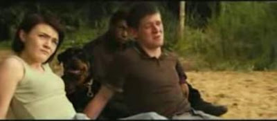
The clothing used here is easily seen as been that of the younger generation but more specifically of the chav or gang culture, this is seen in the use of polo shirts and vest tops, somethings which have become a signature of theirs. The idea of this maybe to hint to the audience about the antagonists of the film, as chavs are relatively seen in a negative way, due to their links to factors such as drinking and violence. The characterisation of the characterisation of the characters within this shot is fairly negative as the use of body language and facial expressions within this shot is negative as they rude and laid back, while the presence of a large dog in the background adds to the negative connotations; as that particular dog is seen as being violent in some cases. The lighting of this shot appears to be natrual, this gives the shot an everyday feeling and will possibly allow the audience to place themselves into the position potrayed here. The location itself is something which is fairly isolated, which is potrayed by the forest in the background, which is something which has some negative connotations which apply to the fact that it is very closeted and isolated for someone to be trapped within it.
Shot 2 -

The clothing in this shot, is fairly normal, not potraying any particular social group due to the use of a cardigan and dress, while this does have the impression of creating someone who is nice and average, rather than someone who would stick out in a crowd. The idea of this is probably to try and characterise the character as being an average person, so that the audience will feel more fear when watching this, as they can more readily place themselves in her position. The characterisation of the character within the shot is negative as it quite clearly potrays that of someone who is scared or fearful as she is very bedraggled looking and this is seen by use of clothing and make up, also her body language is very compact meaning she is protective of herself. The lighting in the shot is a very muted grey/green colour, which gives negative connotations as if it is foreshadowing the storyline, also the dull colours potray the actors emotions of fear, all negative emotions as is the colours. The location of the shot is within a forest, as i stated before, this has negative connotations as it is very compact and isolated, giving the audience ideas of what could happen to you if you were lost in there and no one could find you.
Cinematography -
Shot 1 -
The shot here is done is an unfocused long shot, so that the characters are barely seen in the foreground of the shot, yet still remain the focus, as it is done looking through some tree's and bushes. The fact that the shot is done in a long shot from such a place gives it negative connotions as it gives the impression of someone looking at them from that point; as if they are being watched, which is something that it is not a nice prospect, therefore making the audience more tense.
Shot 2 -
This shot is done in a close up shot, so as to show more emotion, therefore more readily potraying the genre of the film, through it. The emotion within the shot is an effective tool as it looks quite good at showing the negative connotations within the film, as the highlights the fact that the character is distressed as the face is the focus point within the shot. Her bedraggled appearance is something that is highlighted wihtin the shot, effectively showing the audience her distress and therefore giving them the knowledge that it is a horror/thriller.
Sound -
Shot1 -
This shot enhances and focuses on the characters high pitched shriek of pain, something which causes the audience to become very tense in anticipation and fear, as they feel for the character. The shriek, quite clearly potrays the genre as well, because of its negative connotations it applies very well to the genre of horror.
Shot 2 -
Within this shot, music is used in the form of a drum beat, the drum beat has the effect of causing tension, because as the speed of the shots increases, so does that of the music, creating the impression of panic, therefore the genre of horror, as that is an emotion usually seen in the genre.
Editing/Special Effects -
Shot 1 -
The special effect within this shot is fairly normal, but made use of the fade effect, this allows one shot to flow into another, therefore, meaning that the whole thing is more controlled and the audience can understand it more easily.
Shot 2 -
This shot is quite effective in its use of special effects as it jumps from the normal shot to this more red version, casting a negative factor on these characters. The negative connotations of this shot derive from the fact that red is something which is easily seen as being negative as it is the colour of blood and warning signs, therefore becoming something which is either a warning or meaning death. So this shot is quite effective in representing the genre of horror, due to its negative connotations.
Narrative -
The narrative of this trailer is quite structured as it goes in chronological order, Todorov's theory is evident within the trailer as it goes through all the different stages of the equilibrium; those being the original, striving for a new one and finally reaching a new one. Strouse's theory is evident in the fact that the main character is seen as being the sort of hero, striving to against her anatagonists, this gives the audience a sense of familairity.
What do I like or not like about it? -
One thing I quite like about this trailer is the fact that a lot of sound is used within to create a sense of tension, which works really well with the genre and therefore mine and is something I may like to see within my own trailer. What I dont like about this trailer is the fact that it is too long and it basically shows the whole of the film, ruining the film for those who want to see it, as the ending of the film becomes fairly evident by the end of the trailer, this is something I will strive to avoid in my own.
Eden Lake
Poster 1 -
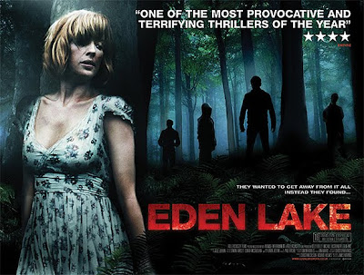 Mise-en-scene -
The film poster here of Eden Lake is conducted in landscape, with the main model dominating the left side of the poster, making her the focal point of the image while she hides behind a tree. The pose in which the model is in within the image, expresses a sense of fear, due to the fact that she cowers behind a tree, with her face clearly expressing worry, this expresses to the audience straight away that the genre evolves around the thriller or horror genre. The lighting within the image is conducted so that the main model is highlighted the most clearly, expressing her fear, but the lighting within the image is also used so as to silhouette the antagonists in the poster, trying to express the sense of fear, that it might envoke in real life as the woman is obviously being hunted. The lighting used on the antagonists also creates a sense of mystery and foreboading with the characters silhouettes, as they are placed within the poster to intimidate, as can be seen in the fact that they are looking down at the main character. The clothing and hairstyle within the poster of the protagonist, is done so that she looks quite normal in apperance, creating fear in the reader as this could happen to anyone, therefore appealing to it's genre. The location within the image is something which may have negative connotations as the poster and most of the film are filmed within a forest, which brings up the thoughts of isolation and other negative themes, therefore creating suspense and intrigue in the audience as it is building upon its genre.
Cinematography -
The poster is set out in a landscape, done in a low angled shot, so that the audience or onlooker is looking up at the protagonist as she hides behind a tree, causing her to be the focal point and then unconciously intrigued and sympathetic as they see the silhouettes of what is obviously the antagonists. The image of the protagonist is done at a medium shot, so as to have her in focus at the front of the poster, therefore intriguing the audience to her obvious distress and later, who are the four mysterious characters within the background? This will draw the audience in and influence them to watch the film, as is the purpose of the poster. This is something which would quite effective within my poster, as the genre is potrayed through as well as grabbing the audiences attention.
Content and Text & Font -
The choice of text within the poster is very bold and done mostly in white, making it contrasting it contrasting to the image, but being able to stand out. The title "Eden Lake" as mentioned is done in a bloodied red, but is also another very bold compact text, which in conjunction of the singular use of red on the image makes it more pronounced and a focal point for the page, therefore introducing the subject of the poster more readily as reason for this. The use of a pull out quote from an external source secures in the viewer that this may be a film worth viewing, as is the promotional value of the poster; because purpose is to push the viewer to watch the film. This use of a pull out quote is something I'm going to try and use for my own poster, as a means of promoting the film.
Colour -
Colours used within the poster are many quite dismal, negative and dark, having negative connotations with the use of greys and blacks, so influencing the audience to understand the genre of the film as being that of a horror film. The lighter colours of the protagonist, highlights her to the audience, as does the big capital lettered "EDEN LAKE" in bloodied red on the background of white, introducing the audience to the film title and furthermore securing the genre of the film in the audiences mind. The light colour of the protagonists dress also makes her more pronounced within the image and therefore the biggest focal point alongside the title.
Special Effects -
The obvious use of editing on the image; with the lighting, making it more shadowed by use of increasing contrast, highlights the atagonists to the audience as they are made more pronounced within the image and therefore foreshadowing the film, making it's genre known as a thriller. The bloodied film title, is another special affect as the text and the blood have been put together, which again brings negative connotations to the genre, therefore influencing subtley to the audience that the genre is thriller or horror.
What do I like or not like about it? -
I quite like this image as an example as the use of image is excellent as the genre of the film is very pronounced in it, with it's use of camera shots and mise-en-scene to grab the audiences attention. The colours used are quite effective in foreshadowing and revealing the genre, something that would be effective within my own product. What i mildly dislike about this poster is the fact that as a landscape, it will be harder for a viewer to effectively take it all in, in one glance as it is more spread out.
Shaun of the Dead
Poster 2 -
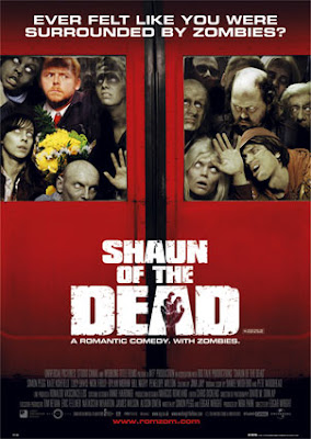
Mise-en-scene -The use of clothing within the poster, points to the fact that the people potrayed in this film, are of no particular class or social group, as is seen in the small portion of images, there is no particular person who is overally potryed. Make-up used for the image makes the majority, except Shaun to look very pasty and white eyed, this is done to the effect, to make them look like zombies, something which is a quite popular theme within horror films now, due to other films like Resident Evil and Dawn of the Dead. The fact that many of the people potrayed in the poster looks like zombies gives the impression of being around the genre of a horror film. The protagonist; Shaun is stood within a mass of zombies as the most normal in appearance, due to the lack of special effects or make-up on him, this draws the audiences attention, while the fact he also holds a bouqet of flowers, seemlessly unaware of the fact that he is surrounded on the subway by the zombies, gives the movie a quite humourous appeal, meaning this film might be made up of multiple genres, such as horror and comedy. The use of lighting within the image, highlights the protagonist; Shaun to the audience, making genre more noticable and playing on the comedy appeal as he stands within the mass of zombies. The facial expression of the protagonist is something which lends a comedy appeal to the poster, as it shows Shaun being clearly confused by the mass of zombies surrounding him, pointing to the genre of the film.
Cinematography -
The poster is done in potrait, something which means that it may be easier for the viewer to take the whole image in, in one look, or at least give a more vague idea to the understanding of it, as a landscape may take longer for a viewer to look at. The shot that is actually used within the poster is done in a long shot, this gives more information for the viewer to look at and in the case of Shaun of the Dead, allows them to actually depict the genre of the film, as comedy and horror are both shown within the image used.
Content and Text & Font -
The title name of the shot is done a large, bold and white font so as to be more effectively seen on the red background, making the film more known to the audience. The font used for the title lends negative connotations to the genre of the film as the gritty look of it, in combination with the grasping hand give a more horror feel to the film, hinting to the audience of the genre of the film, therefore informing them on whether they may be interested in the film or not, due to their personal preferences. The text "Ever felt like you were surrounded by zombies?" done in white text, solidifies the audiences original thought that this is a zombie film, after they look at most of the models shown in the image, therefore gaining the knowledge about the genre. The small portion of text "A romantic comedy. With zombies." is used in white text again, but in a smaller font, so as to be seen after the title pushes the knowledge of the genre of the film onto the audience, therefore performing its point as poster, as it is advertising the film, but letting the audience know what it will about.
Colour -
The use of colour within the poster is varied, as the colour red it highly used as a background from the supposed subway train, but acts a bright colour, drawing the audiences attention as it may stand out in the midst of less bright posters or a plain wall. The use of colour actually models or people in the film is fairly dismal as the zombies are potrayed by use of pale, death like colours hinting at the factor of death, while protagonist is done in brighter and stronger colours, so that they stand out in the midst of the zombies. Most of the text, is mainly done in white, so as to stand out on the brighter red background, therefore drawing the audiences attention and informing them. This maybe something I choose to do in my own product as the use an opposing colour for the text, will mean that the audience will be able to understand it more easily, therefore advertising the film better.
Special Effects -
The highlighting of the protagonist, as i mentioned before is particulary effective as it highlights the protagonist to the audience, as it becomes a focal point within the image, while keeping the anagonist as a background to the protagonist.
What do I like or not like about it?
Within this poster u like the use of mise-en-scene on make-up to effectively potray the zombies as an important factor within the film, as it shows to the audience what the film is about, something I may try to use myself. Another thing I like is the use of a gritty looking text to potray the genre, as the title is usually one of the first seen things when looking at a poster, meaning that it effectively potrays the genre.
Total Film (Jennifer's Body)
Movie Magazine 1 -
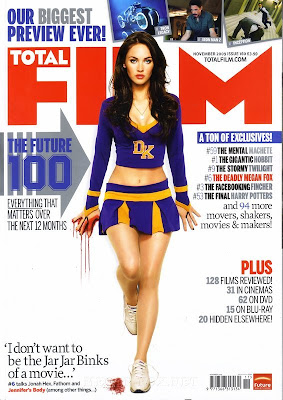
Mise-en-scene -
The clothing used within the main magazine image is fairly seductive and sexy due to the use of the cheerleader outfit, which has fairly sexual connotations or is linked with the idea of beauty, something which may give the audience an idea of the film and can be linked with the film title "Jennifers Body", so the sexual connotations may come into play within the film. The use of make-up within the main image is something that reflects the genre of the film, as her left hand is covered in blood, something which has negative connotations as it leads the audience to think of the horror genre, therefore revealing the genre to the audience. The way the make-up is used in the shot is fairly smart, as it is not something that the viewer notices straight away, but is something they notice after looking at the attractive model, so the model is used as a way of drawing the viewer in, which may lead me to believe the film or the magazine is aiming to attract a mainly male audience, or it could be that men are the main readers of the magazine. The use of lighting within the shot of the main model is mostly bright therefore making it blend more with the white background but making the clothes more pronounced and contrasting to the background in the process, therefore making it more of a focal point, as it stands out more. The body language and facial expression of the main model within the shot has seductive connotations as it shows a lot of her body to the viewer, which is very sexual and may yet again be idea and way in which they attract the audience, as it stands out more and is more likely to draw anybody's attention, specifically a mans.
Cinematography -
The magazine itself is done in a potrait, which is the usual way in which a magazine is laid out and means that the audience can easily identify it as magazine due to this, rather than if it was laid out in landscape, the magazine would be harder to recognize as what it would be if it was set out like that, as the reader or viewer would get confused. The main image used, is set out in a long shot, so as to show the entire part of the model, therefore introducing the sexual connotations i mentioned earlier and drawing the audience in with the use of that, also the long shot allows the audience more an idea of what the film is about, rather than like a smaller image, such as one of the images used at the top of the magazine front cover. The images used at the top of the page are partially effective in their use, as they allow the audience slight glance at the film, while not giving too much away with the shot, so they maybe interested enough to read on, also they are effective in adding some activity to the otherwise white background of the magazine.
Content and Text & Font -
There is a variety of texts used on the magazine front cover, but the majority of the ones used are bold and colourful or otherwise plain and small; giving more detail on something. The use of bold text that range in colours from red, blue and grey is that they stand out on the plain background, but also fit in with the mise-en-scene of the main image as they are colours which contrast or are actually seen in the image, also some of the choice in fonts are similair to that of the numbers shown on the top of the model, further proving my point as the text is made more of a focal point in conjunction with the main image. The smaller text is used a means of explaing the larger text, or giving more information therefore its made smaller and less bright as to not draw attention away from the main focal points, it fills up dead space effectively. A pull out quote from the interview with the star from Jennifers Body, this is effectively used in a black text in the midst of dead space so as to draw attention to it and draw the audience in with the revealing text from the interview.
Colour -
The use of a white background within the magazine allows all the other objects or content on the page to be more visible on the front cover of the magazine, therefore more effectively attracting the audiences attention with the content, but maybe also standing out within the other magazines. The use of red, blue and grey text is used effectively to contrast and appeal alongside that of the mise-en-scene from which it is derived from and makes it more prominant on the front cover due to this, rather than it being a mix of odd colours. The use of red as with the blood, has negative connotations as it is usually linked with death and violence therefore representing the genre as being possibly that of a horror.
Special Effects -
The main image looks as if the contrast and such has been enhanced on the image therefore creating a more brighter and sharper picture to the audience and standing out on the front cover, advertising itself through this means.
What do I like or not like about it? -
With this front cover, i like the use of a plain background so as to showcase the focal point of the magazine more effectively, as it will get viewers or readers to be able to see your film being advertised more easily than possibly other magazines. Another thing I like that is used within this front cover is the fact that the genre of the film is not shown straight away as way of advertising the film, which means that it may be able to draw readers in that aren't even interested in the genre, as the genre of the film is shown subtley due to the prescene of blood in the shot. What I am not to keen on in this front cover is the amount of dead space, which is used effectively in this front cover, but in others could be disastorous as it may make the viewer think the magazine is not interested or unprofessional due to this.
Total Film (Prince of Persia)
Movie Magazine 2 -
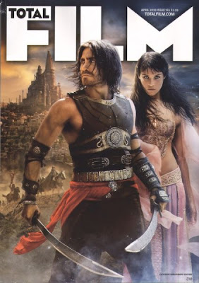 Mise-en-scene -
 The clothing used within this article is clearly expressive of a particulary genre, due to the old and cultarised connotations, which express that this genre will be set in a foreign country and possibly an older time. This is seen in the objects worn or held by the models, such as the swords, these a typically used to represent an older time, due to the lack of technology at the time, the clothing worn by women point to another culture, as it is not something worn by our own, or ever has been, but it also has the connotations of appearing more mystical and therefore representing the genre of fantasy. The lighting within the magazine front cover is fairly natrual with a dusty look to it, which adds to the thought of another culture or another country due to that, but also it highlights the characters to the audiences attention while lightly touching on the genre as it gives a magical look to them which may be a representation on the genre as being a fanatasy film. The scenery which has been edited background, confirms the reader or viewers perception on specifics of the genre, such as the fact it is set in another culture and time, while the towering civilization in the focal background points to the fact that it's a fantasy. The body language and facial expression point to a violent and mystical undercurrent within the genre, as the mans stance is very masculine, with the addition of the swords, to potray a certain amount action to the film, therefore flaunting/advertising the genre, while the woman body language and facial expression gives a certain mysticality to the film as she appears to be calm and in control.
Cinematography -
Again like the other magazine, this magazine is done in potrait; the basic model of a magazine, therefore showcasing to the audience that this is a magazine when they see it on shop shelves, meaning it is easily identified. The images that are taken of the models are done in a medium shot, so that most of the body is shown, while space surrounding the models is still clearly evident, meaning more of the background is shown and therefore the genre is better represented. The medium shot is also better in showing the models, as if they were to use a mid shot, it would mean less of the models would be evident therefore, with the use of a medium shot more of the model/ actors are shown, meaning they can showcase their mise-en-scene more effectively and represent genre of fantasy. The background, although done by special effects is a very long/ wide shot meaning that their is no focal point within the image, but the image itself represents something, such as the genre, due to the large dizzying civilization which may not be there in real life, i believe it to be showing fantasy.
Content and Text & Font -
This magazine cover dosen't have much in the way of content, rather they use the image to showcase itself and draw readers in, as the image is clearly evidently an advertisement for film, because imagination and sophistication are seen in the image, due to use of special effects, therefore showing the reader that this is a film magazine. Little text is used except the essentials, such as the title of the magazine and the website and such, the title is done in the same large bold font as the magazine before, yet this one is done in white and again placed behind the subject or model of the film, so as to make the model the focal point but to contrast appealingly with the image and be something that they later see. The title has had an underlining shadow used on it, so that it is more pronounced on the page and dosen't fade into the background, supporting my idea that its not meant to be the main focal point but neither is it meant to be lost in the background. The website and that is done in the same font and colour as the title, continuing the theme and adding a sense of sophistication as it contrasts appealingly.
Colour -
There is no main colour which themes throughout the front cover, but one thing that is evident is that the colours are all quite faded with little use of bright colours. The colours used in the background all have a quite faded, dusty appearance to them, giving the impression of a foreign country and a warmer climate. The characters themselves are both wearing articles of clothing or objects which draw attention to them due to their colour and lighting, such as the red and purple clothing on them, this causes them to be the focal point of the image as the rest of the image is quite similair in comparison of colour, therefore stating the genre, as the mise-en-scene and such states it to be a fantasy in the past, within another country.
Special Effects -
Special effects are quite evident within this cover, as firstly they are used to add a bright mystical looking aura that surrounds the characters and draws attention to them, while showcasing the genre, as it becomes evident that it is trying to appear magical and therefore can be applied to fantasy. The characters themselves look as if the contrast or temperature of their images has been increased to give a darker and dustier looking appearance, which can be applied to the background to make the genre become evident.
What do I like or not like about it? -
One thing that I like which is used in this front cover is that the editors have used the image to represent the magazine and speak and advertise for itself, which means that there is little content involved in the front cover, this is an inventive and different way for showcasing a front cover and will stand out due to this. Another thing I like is the use of special effects to create a sense of fantasy mysticality within the image and showcasing the genre through this. Lastly I like that little variation in colour is evident and that the bright colours are used on the characters to make them a focal point.


 In analysis of the data collected from pearlanddean.com it shows that when it comes to gender with these films, it is quite similair in size, meaning that this genre may appeal to both males and females. When looking at the age of the people watching these films, it is quite simialair throughout with the age group of 15-24 being the dominant age group watching this genre, with 25 - 35 usually being the next dominant age group. Of course the younger age groups are at 0% due to the fact they are too young to watch the films. Variation in the trends can be seen with such films as The Descent: Part 2, dropping in percentages and being higher in the next age group up, this maybe just a coincidental thing though as the rest of the films follow the trend that 15 - 24 are the highest in percentage and the next group is the next highest and so on. When it comes class there is no common trend, but throughout them C1 seems to be the dominant class throughout, which maybe because they are the largest group overall. In conclusion in analysis of this secondary, quantative data I find that the genre I have chosen may apply to both male and females in large numbers, while 15 - 24 year old and people of the class group c1 would be my dominant groups.


 To analyse some of the results collected from my questionnaire I constructed some pie charts to reflect some of my results. In my questionnaire when asked what their favourite film genres were they could only state two of their favourites, the majoirty as can be seen in the pie chart above said that they liked horror. The implications of this is that the horror genre must have a large market therefore it may mean a more neutral way of advertising as it could cover whole different segments of people. The second pie chart shows that the gender within the first pie chart is equal, the size of each gender who liked horror is the same, again meaning that advertsing for the horror audience more towards targeting a mass audience. In conclusion of my finding with my findings from questionnaire I find that my audience for a horror film could be equal in size of gender and quite profitable in the way that the majority of the people I asked enjoyed the horror genre more than any other.


