Rationale -
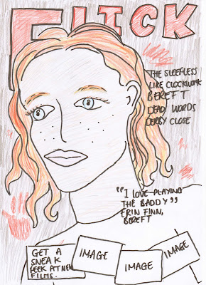
With my magazine front cover flatplan I have chosen to use a mid shot of my model(s) so as to get the image to the audiences attention and then draw them in. I decided to use a large bold text for the title of the magazine, because this would stand out more than a smaller finer font, therefore grabbing the audiences attention. I have chosen the text to be red due to its negative connotations and its application to my genre, but it also contrasted appealingly and fit in well with my image, this would attract the reader, but also inform them of some hidden horror connotations. I have used a pull out quote from an interview with my character, so as to attract the audience and to act as an incentive to read the magazine. Finally I also included some sneak peak images at the bottom of the page, so as to add some more activity to the page, while also like the pull quote acting as an incentive to read on.
Poster - 
Rationale -
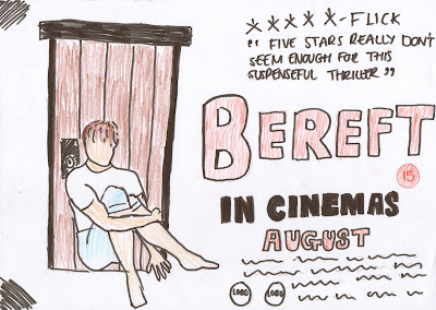
For my poster I decided on using a long shot of my character sat in front of door, so as to potray the isolation and negative emotions within the shot, therefore reflecting the genre and the story line of my trailer and informing the audience of this. I placed the shot to the left of the poster, as this would mean that it would be seen as a focal point, due to the fact that we read from left to right, meaning the image would more than likely be seen first. The image is faded so as to portray the dull, negative emotions of the film through the colour and tone. I decided again to use a large bold red text, because again, it grabs peoples attention, but also the colour acts as a portrayal of the genre. I used a quote from my invented magazine so as to combine the two, while also the positive criticism of the film would act an incentive for people to go and watch the film. I also included my logo's in the poster, because the audience usually like to know that this is a professional film, so by being there on the poster, they act as an incentive to watch the film. I set my poster out in this way, due to the fact that many other posters, such as Eden Lake have a similar layout and its therefore unconciously informs the reader that this is a film poster.
1 comment:
In your rationale provide more technical detail and discuss the connotations of each technical aspect. Also, tell me why!!! you've decided to do what you have.
Post a Comment