Rationale -
The location of a forest is ideal for my trailer, as it corresponds to a key scene within my trailer which takes place within a forest. Also a forest applies my genre, as it appears to have negative connotations, by how dreary and isolated a person would feel in there. The lighting within the forest will be very shadowed, so therefore again being applicable to the negative vibes of my genre; which horror and thriller. The location is also away from the public meaning that, it will be safe to shoot and no one who wouldn't like to be shot will be seen within the film. This set will be used later on in the shooting of the trailer, as the scenes taking part here are later in the trailer and also it will need a bit more prepariation and planning.
Street/Road -

Rationale -
The location is to be used in a key scene within my trailer, therefore this location is very applicable to my storyline. The location also has a vast open space, which could be ideal as it may represent the isolation of a particular character, while also a driving scene could come into play. The lighting in this shot will be very natrual and open, meaning that it will represent an everyday life and could therefore increase the tension in the audience as the storyline could happen to them. The location is in a public area, so filming will have to be careful, but from my own experience I know it to not be busy. This location will be used mid way through the shoot for a couple scenes, with the added use of a car and possibly some constructed special effects, the feeling behind this shoot will be that of desperation.
Garden and Front Garden/Front door -

Rationale -
This location's again are appropriate as a garden will feature within my trailer and so will a front door at the start and therefore it is following my storyline. The area are very light open, which is something which could be used as a contrast to the negative feeling of the storyline; making the trailer more realistic. The lighting as mentioned is very light, open and natrual meaning that like the street area, it can be used as a comparison to the everyday life. The areas are away from the public and totally accesible to myself and actors. This location will also be used mid way through the shoot, for one key scene, the effect will be a contrasting feeling to the genre of the film, giving it a more surreal feeling.

Living Room/Party Room -
 Rationale -
The location is a possible one, as a party will feature within my trailer and the living room, could be used as a possible space to represent it. The area is very enclosed and personal, with the added use of blinds and curtains to the darken the room, so as to give the room a party vibe. The lighting of the room has both use of natrual and fake lighting, with the added use of dimmer switches, meaning lighting is greatly controllable. The area is away from the public, meaning it would be an appropriate spot. These location will be used early on in the film shoot, as it provides the introduction to the film, the feeling and the emotion at this point will be that of a relaxed party vibe.
Hallway/ Landing -
 Rationale -
The location is appropriate to my trailer, as a closed space with a door features in my plans, meaning that this space would be ideal. The lighting of this spot, is mainly fake due to the enclosed quaters it means that very little natrual light gets in, which could be a benefit, as it could represent the negative feeling within the trailer. The area is again away from the public, so is appropriate. This location will be used at the very end of the shoot, to provide a eerie and thrilling cliff hanger to the trailer.
Bedroom - Rationale -
This area is ideal as a bedroom is highly featured within my trailer, meaning that this being my own would be totally under my control. The dark colours which feature within the room would be great as they could create the dark negative feeling of the characters emotions in the scenes within the room. The lighting is both natrual and fake, meaning it is controllable. The space is away from the puble and therefore more usable. Most of the shots within this trailer, will take part within this room, as it is the key location of the film, it will be used to provide the feeling of isolation and claustrophobia.
Reece of location for Poster and Magazine Cover -

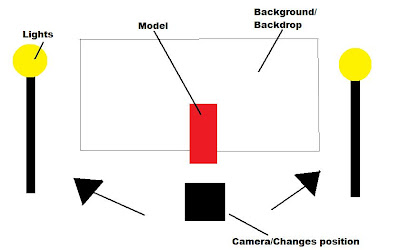
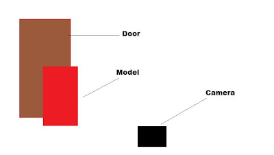
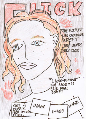
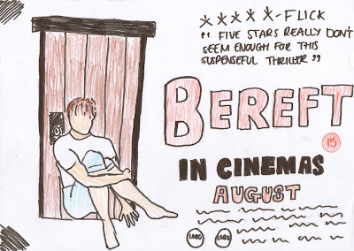
I believe this location to be ideal for a location within some of my shots in the magazine and poster, firstly due to the fact that it provides a plain white background which is key to my magazine and poster as I will be able to control the colour of it through editing, while also adding more effects or objects in the background with more ease. The studio is also ideal as it provides key lighting to either side of the background, which will provide a high key image; perfect for the front cover of my magazine and the enviroment of the location is completley controllable by me as the director which may not be applicable factor within out-door locations. This location is also away from the public meaning their will be no distrubance to them or the shoot, meaning a more easyily done photo shoot and better pictures.
Risk Assessment's -
Project Title - Trailer/Bereft
Filming Date - 18/9/10
Forest -
Location - Forest
Producer - Aaron Horsfield
Hazards -
- Animals/Insects
- Slipping, tripping, falling
- Weather
Hazard 1 -
What could cause harm? - Animals within forest
Likelihood of this happening? Unlikely
How much harm? Slight
How will the risk be managed? Control
Hazard 2 - Slipping, tripping, falling
What could cause harm? Muddy hills, branches and ditches
What is the likelihood of this happening? Possible
How much harm? Not much
How will the risk be managed? Control
Hazard 3 - Weather
What could cause harm? Lightining
What is the likelihood of this happening? Very Unlikely
How much harm? A lot
How will this risk be managed? Control
Street/ Road -
Location - Street/Road
Hazards -
- Audience/ Public
- Roads
- Vehicles
Hazard 1 - Audience/ Public
What could cause harm? People
What is the likelihood of this happening? Unlikely
How much harm? Depends on control
How will this risk be managed? Control
Hazard 2 + 3 - Roads and Vehicles
What could cause harm? Vehicles
What is the likelihood of this happening? Unlikely
How much harm? Depends on control
How will this risk be managed? Control
Garden -
Hazards -
- Heights
- Weather
Hazard 1 - Heights
What could cause harm? Steps
What is the likelihood of this happening? Unlikely
How much harm? Slight
How will this risk be managed? Control
Hazard 2 - Weather
What could cause harm? Lightining
What is the likelihood of this happening? Very unlikely
How much harm? A lot
How will this risk be managed? Control
Living Room/Hallway/Landing/Bedroom -
Location - Living Room
Hazards -
- Electricity
- Fire/ Flammable material
Hazard 1 - Electricity
What could cause harm? Electrical items
What is the likelihood of this happening? Unlikely
How much harm? Considerate
How will this risk be managed? Control
Hazard 2 - Fire
What could cause harm? Electrical items
What is the likelihood of this happening? Very Unlikely
How much harm? Considerate
How will this be managed? Control







+)
+.jpg)
